Showing Setup to Socially Sway Society
I've had a bit of a hectic week, so the in-depth post initially planned for this week will instead come in a couple of weeks (next week's post is time sensitive, so it will come after that). Instead, I have something a little more light-hearted and casual! Regular readers will see a new button in the menu, titled "Setup".
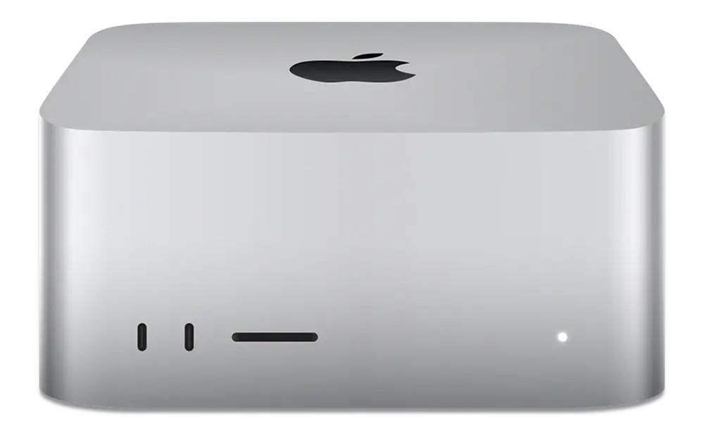
Want to know the gear I rock, how much I like it, and why? That's the place to see it all! Within the table, you can click on a product name to see a mini-review of the products. Even calling it that is a bit of a stretch; it's more of an informal look into why I use what I do and how I make it usable. For example, the Mac Studio page features a list of all the software I use to make macOS more powerful!
If you'd like to discuss more, you can always reach me on Mastodon at @georgeprobably@social.lol but remember to keep the conversation civil! Just because I like it doesn't mean you're not allowed to prefer something else (though, if anyone unironically says the words "not a retina display", I will freak out). I need to make the pages prettier (adding an image at the top, so it's not just a wall of text), but it's functionally all there. I'm slowly adding more devices, so please be patient!
You can either see this as "glass half empty" with no real post this week or "glass half full", as I've got 12 pages worth of setup content. I have genuinely written more for this week than in any individual post! Right now you can head over to the setup page and see the 10 items I have written pages for, I'm sure you'll love them! I have tried to make sure it's a variety of items.
Blog Redesign
I've wanted to do this since day one. However, it has been about five years since I have done any serious coding of any form, and my CSS was terrible even at my peak, so the look we had was about as good as I could pull off. Well? After spending lots of time trying to make Flex work the way I want, we now have two columns! This means I can add more things without looking dumb, so there's a search box to find specific posts, and the page will re-size to fit onto a mobile device.
I'm sure that this is the kind of thing that most people who are even slightly technical will scoff at, but it's nice to slowly get back towards something I enjoyed doing before I got burnt out. (Maybe a topic for a later post?)
You may have also noticed some tweaks to the colours used. I did this to improve readability and make the differences between light and dark modes more obvious. I talked about it more in this thread:
Making Pretty Pictures
Along with the general redesign, I put a lot of work into ensuring that the pictures used in the setup pages look as good as possible. I spent a couple of hours sourcing transparent images, re-sizing them to remove the padding and make them consistent, and then feeding them through a couple of different image containers, depending on where the images appear.
In the setup page itself, the images are served in 1:1 format. In the item pages, it's 2:1. The pictures themselves are transparent PNGs, and they get the background from their container, with textures from Transparent Textures, to make sure it's not just a single block of colour. The semi-transparent texture also means that it will automatically match your browser's light/dark mode!
Something about these adaptive pictures has been really interesting to me, I explored it a little bit with the graph I use in Who Are You? and I want to do some more experimentation with it. For right now, it's cool that I can just drop any image into the Setup pages and it will be made to fit with the others!
Note: Obviously I'm not actually trying to sway society into using all of the things I use in a synical plot to make what I like more popular... or am I?